
The “P” proposed to the importer featured an enlarged bowl that extended over the rest of the Pirelli name, mimicking the elasticity of rubber. It’s a romantic origin story that ties the logo to the product, but it’s all a bit too neat…
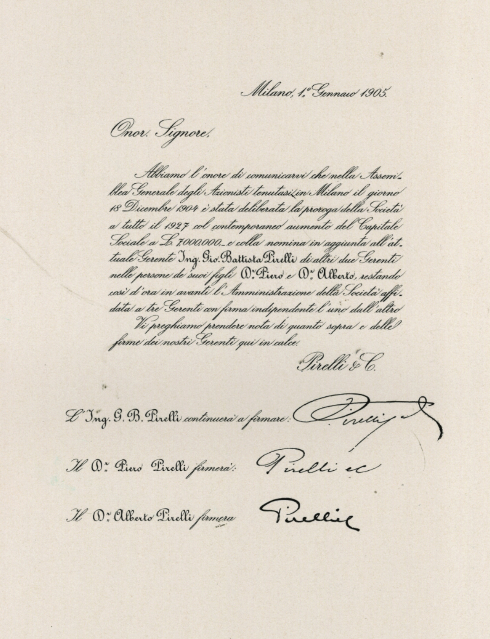
There might be an even simpler explanation for how the Pirelli ‘P’ came to be: Consider the genetic affinity between the “long P” of the logo and the oversized P in the signatures of Giovanni Battista Pirelli, the engineer who started the company, and his sons Piero and Alberto.
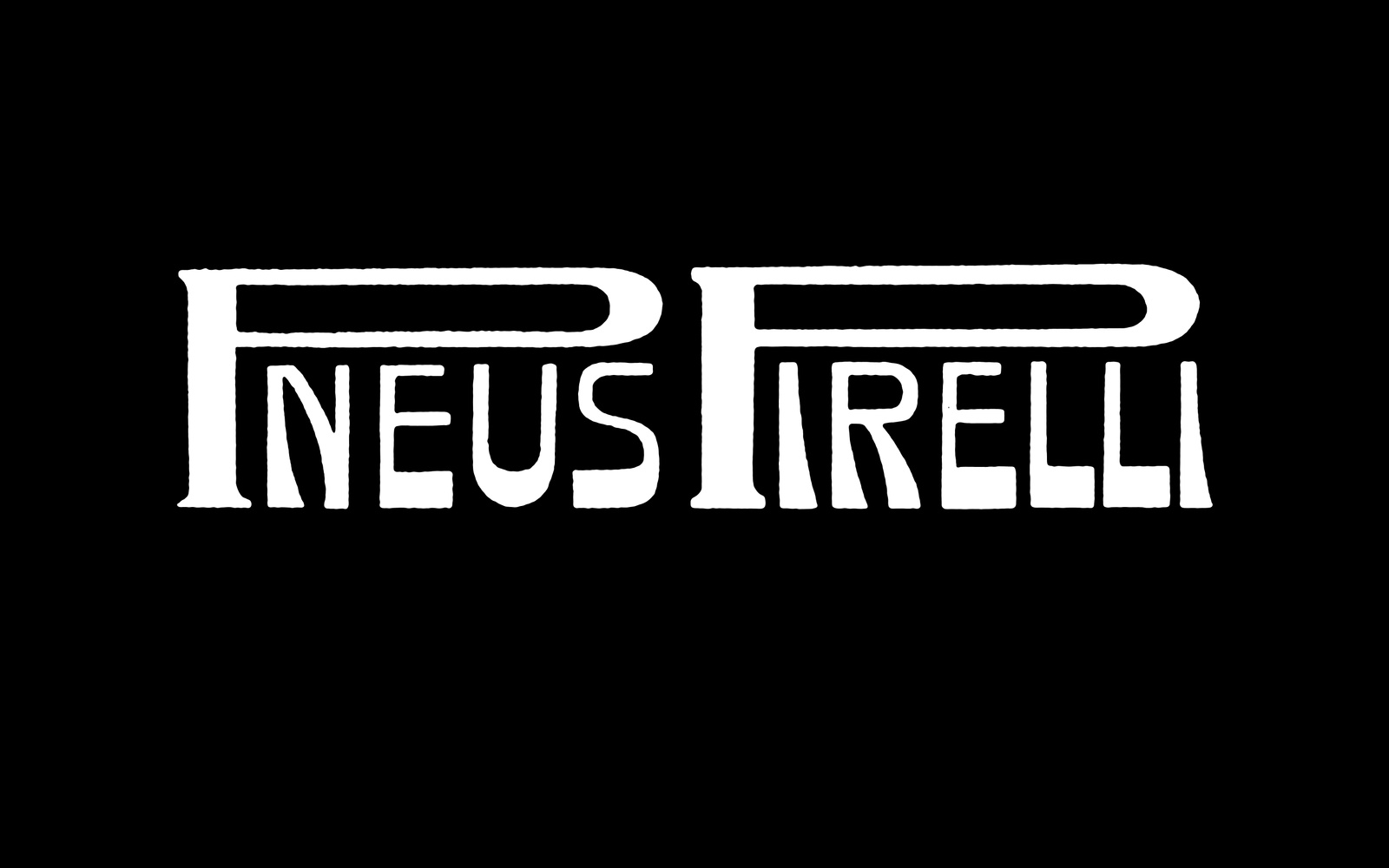

But regardless of the reason, the sketch produced for the race set into motion the makings of one of the most iconic logos. Throughout the 1910s and 1920s, the P began appearing on advertising material related to products such as Cinghie (belts), Gomme (tires), Pneumatici (tires), or Tacchi (mills).
Outside official communication, artists, such as Filippo Tommaso Marinetti, began using the “long P” in their work, allowing the logo to acquire new and unpredictable meanings.
It wasn’t until October 29, 1920, that the company trademark was registered in the patent office, along with a description: “PIRELLI whose characteristic is given by the disproportionate extension of the letter P so as to dominate the remaining other IRELLI letters.”
In the decade that followed, Pirelli’s internal propaganda office hired advertising artists to apply their own interpretation of the Pirelli lettering, which embodied both the stylistic hallmarks of their individual authors as well as the aesthetic spirit of the times.
As excitement grew around advertising and graphic design emerged as a new profession, Pirelli managed to employ practically Italy’s entire first generation of graphic designers.
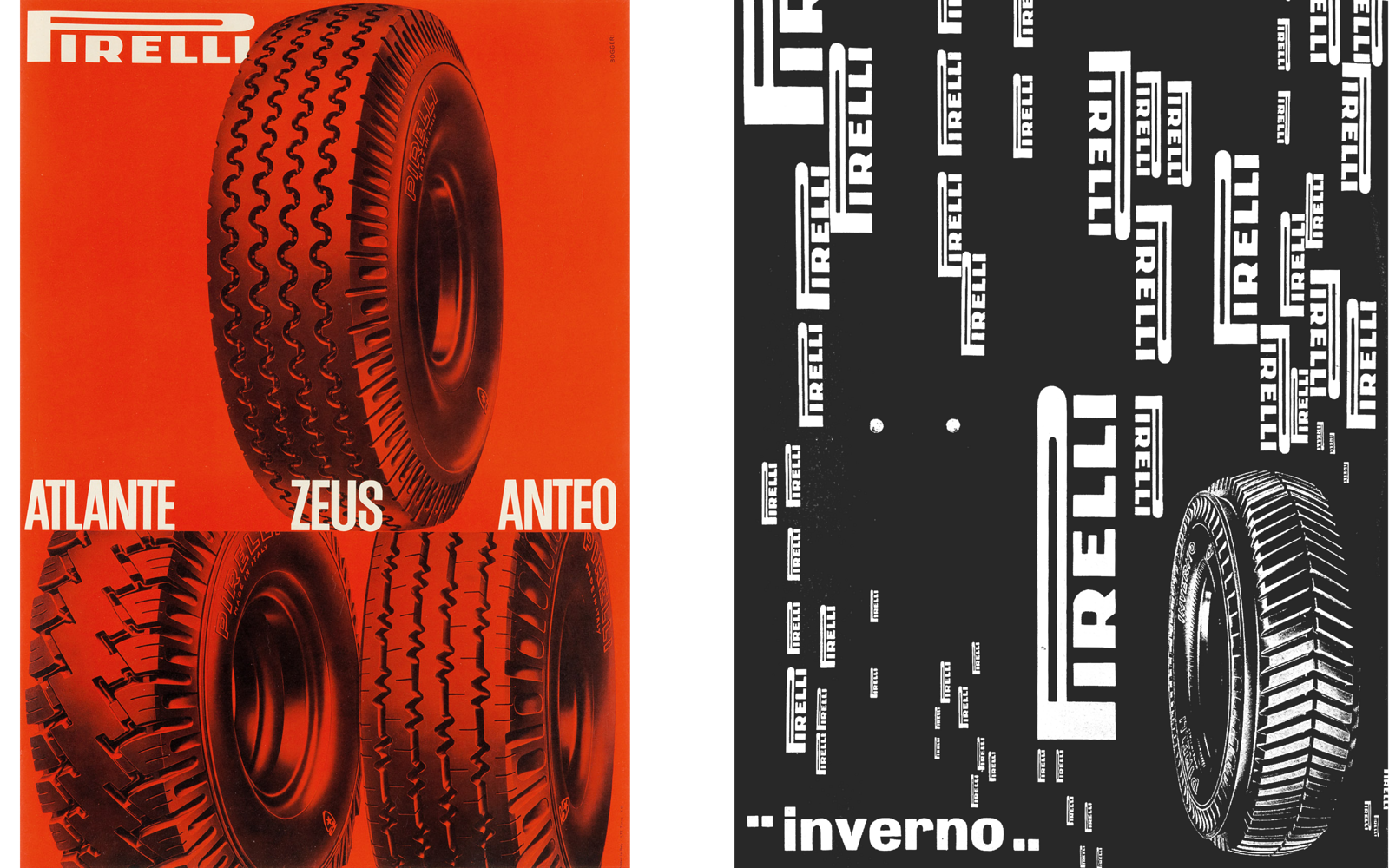
Between the ’30s and the ’50s, Antonio Boggeri, Ezio Bonini, Erberto Carboni, Franco Grignani, Bruno Munari, Albe Steiner, and Luigi Veronesi would all work at Pirelli, establishing a “Milanese style” of graphic design.
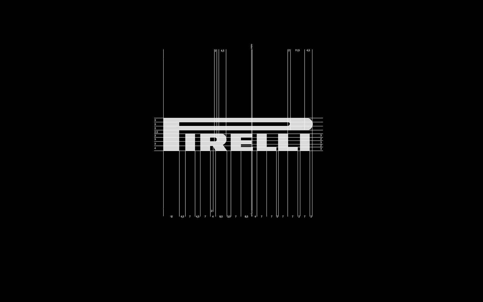
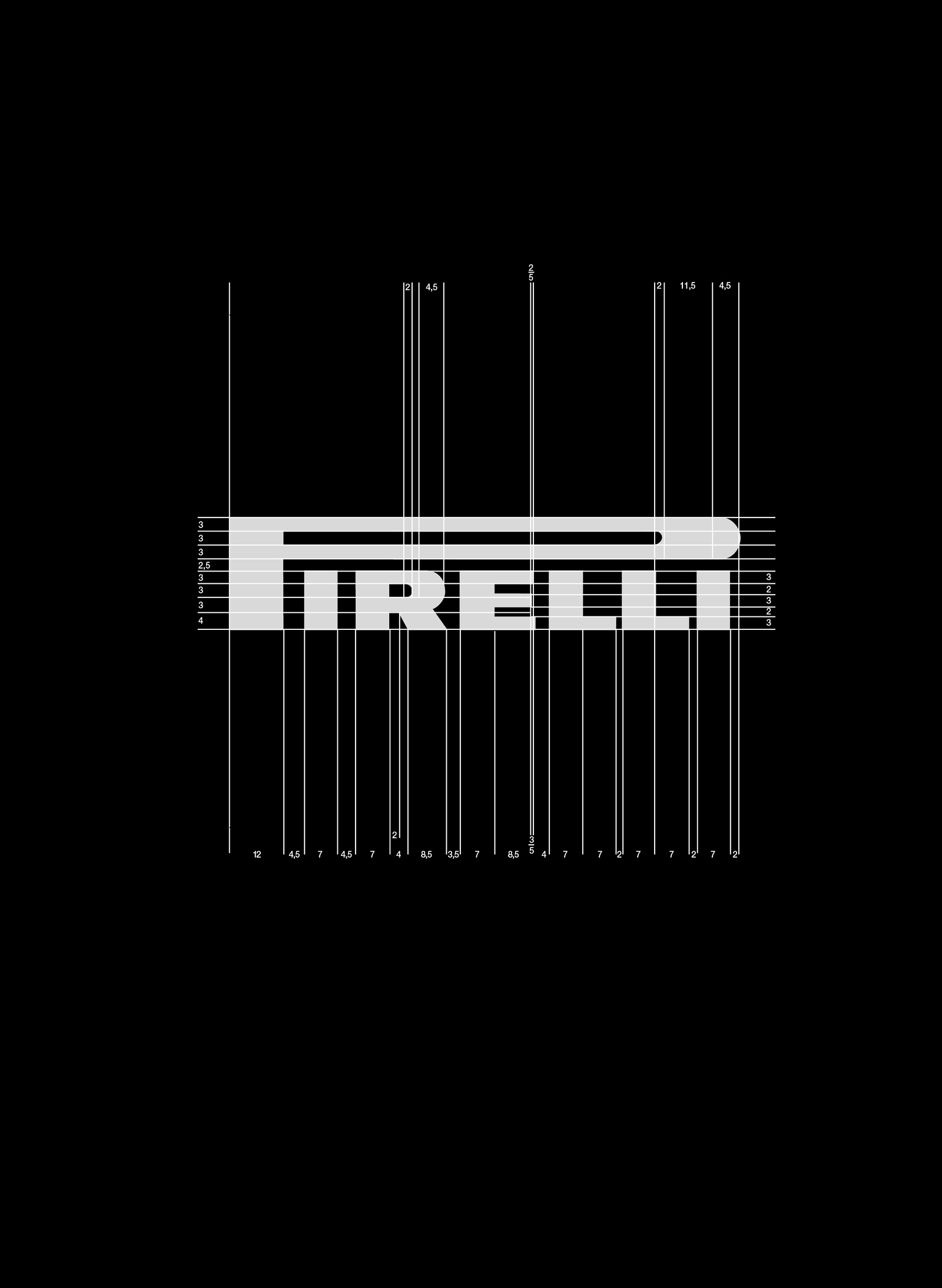
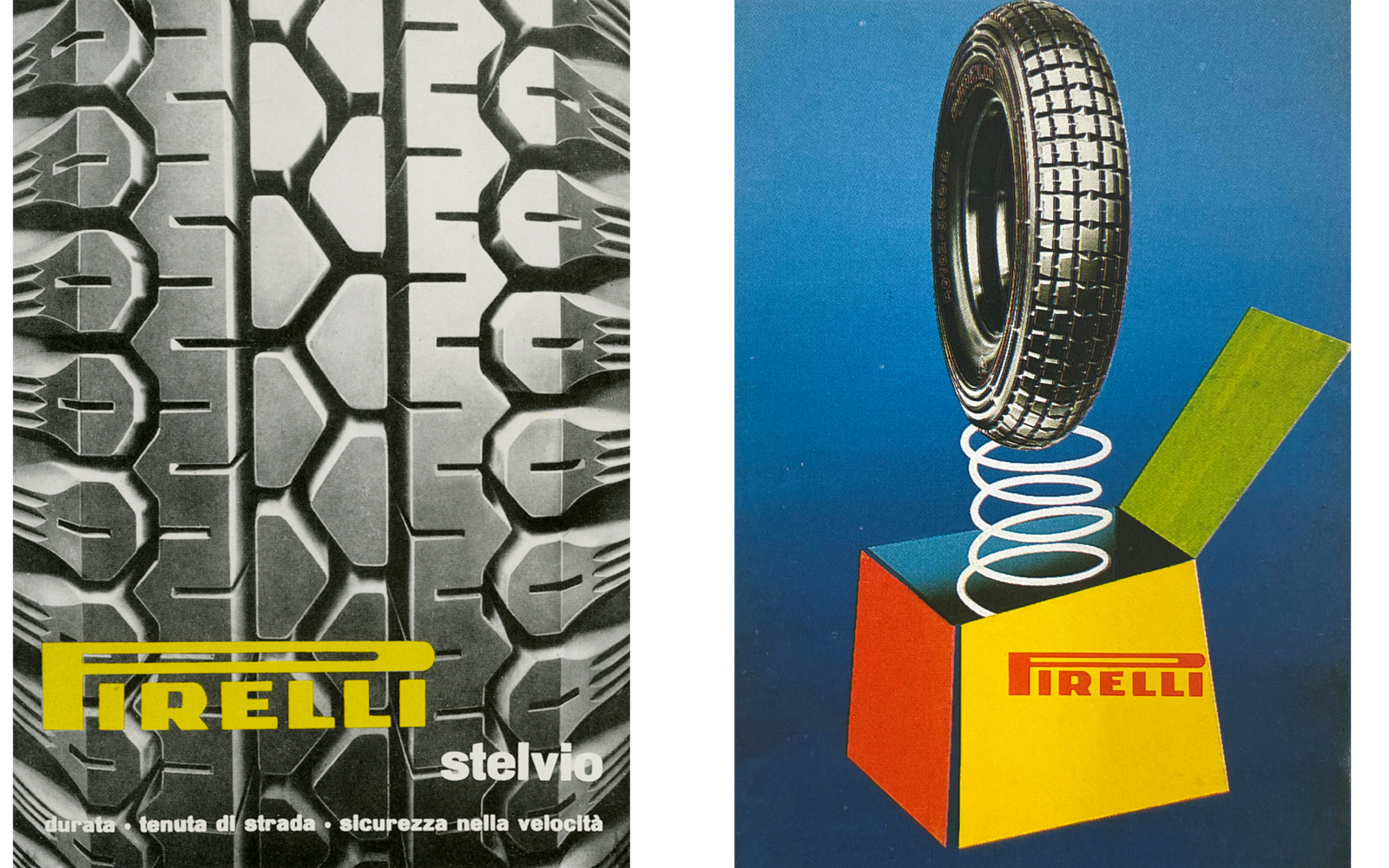
In the mid-’40s, the “long P” was no longer simply a way of writing the company name. It became a standardized logo with set dimensions derived from the form of the “P” and thicknesses of the other letters.

The ’60s began with efforts to further codify the Pirelli logo, with slight variations on the letters “R” and “E,” and the establishment of the “ideal reproduction” of the logo as red on a yellow background.
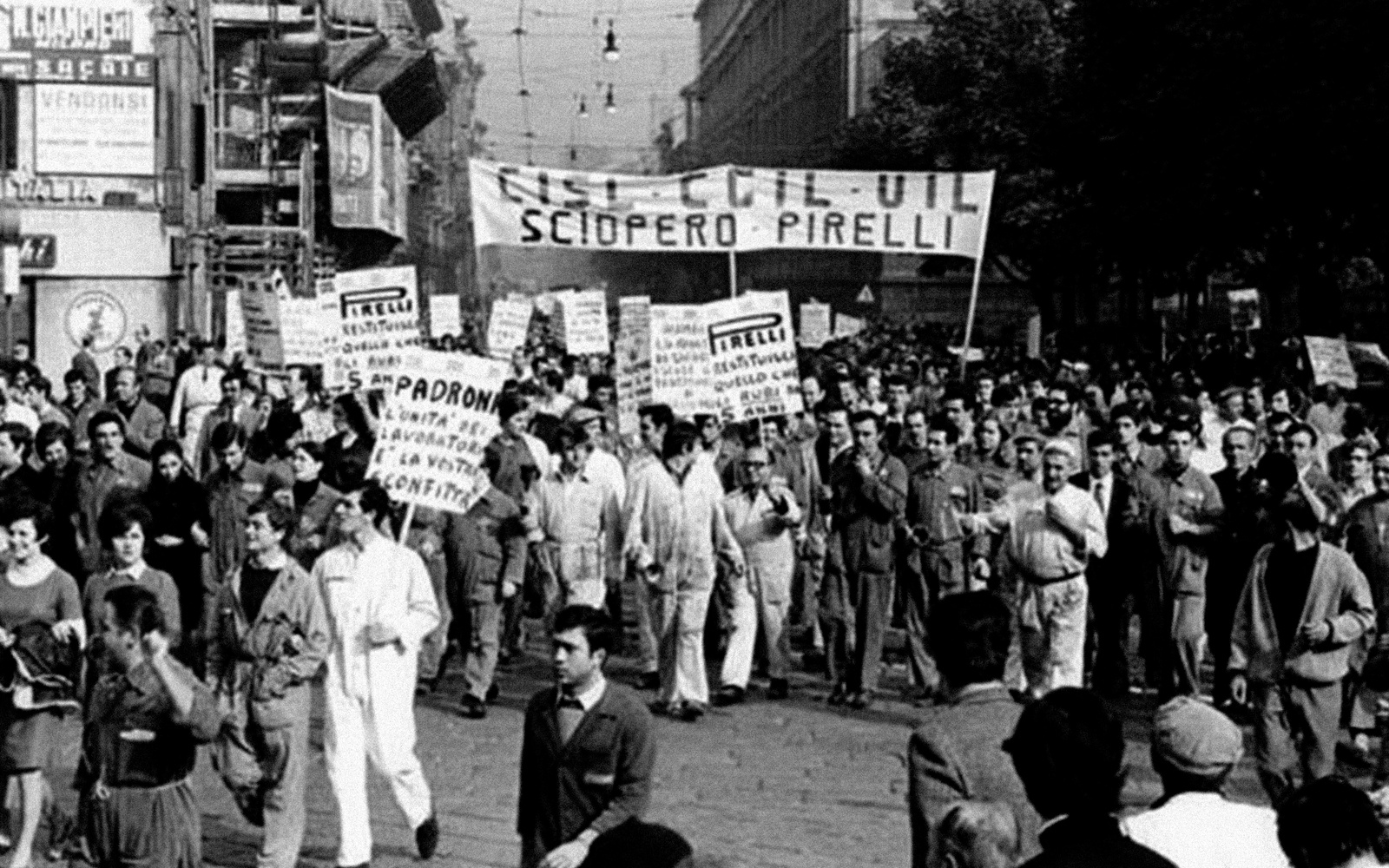
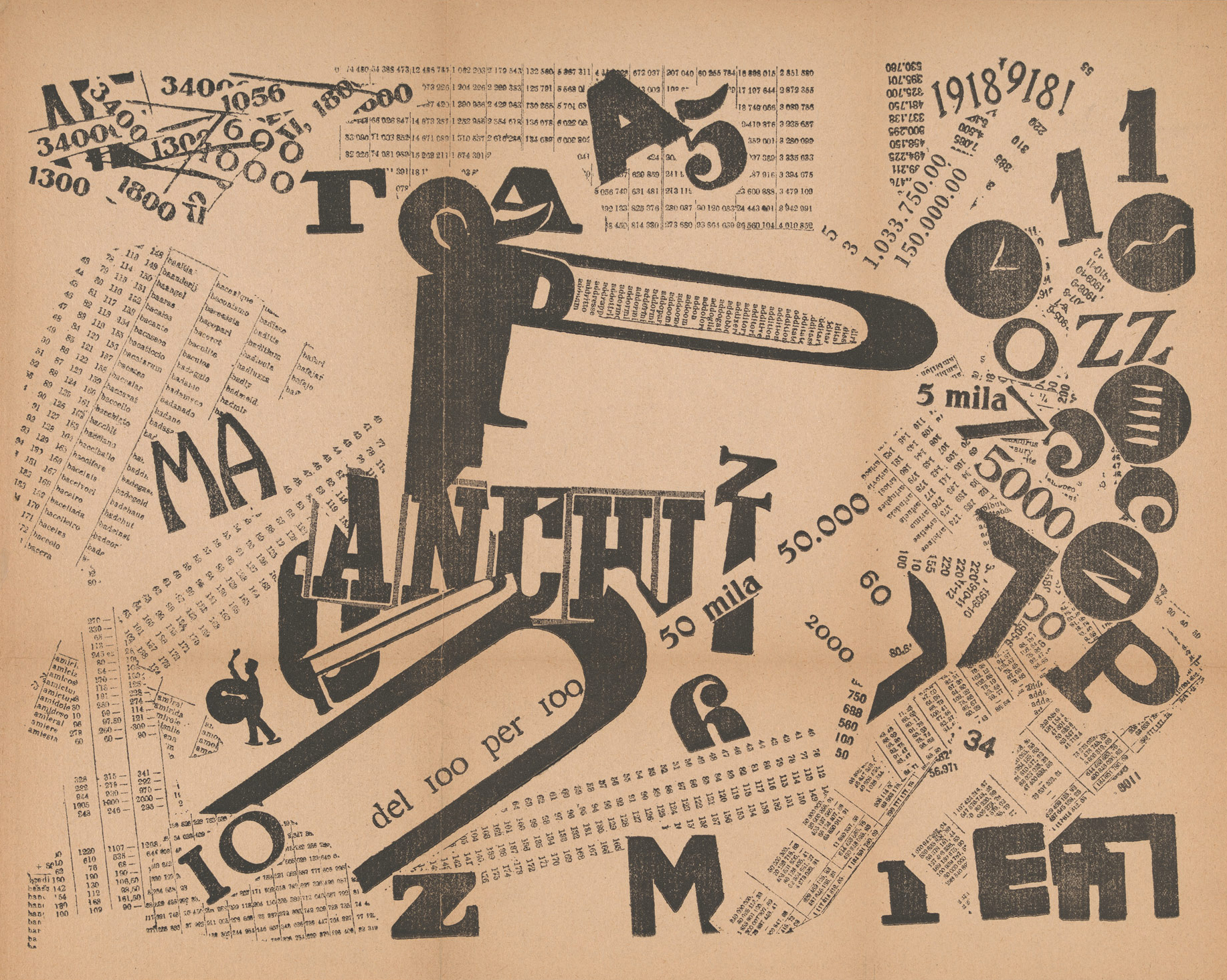
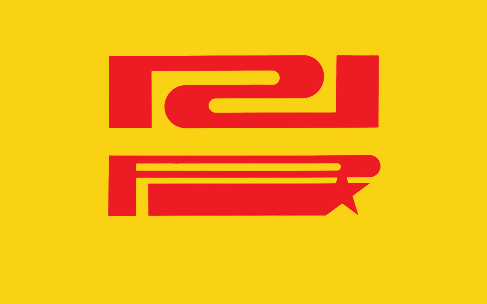
Yet the decade would end with a flouting of that order and regulation— as the logo was urgently reproduced on the flyers, posters, and banners of struggling Milanese workers.
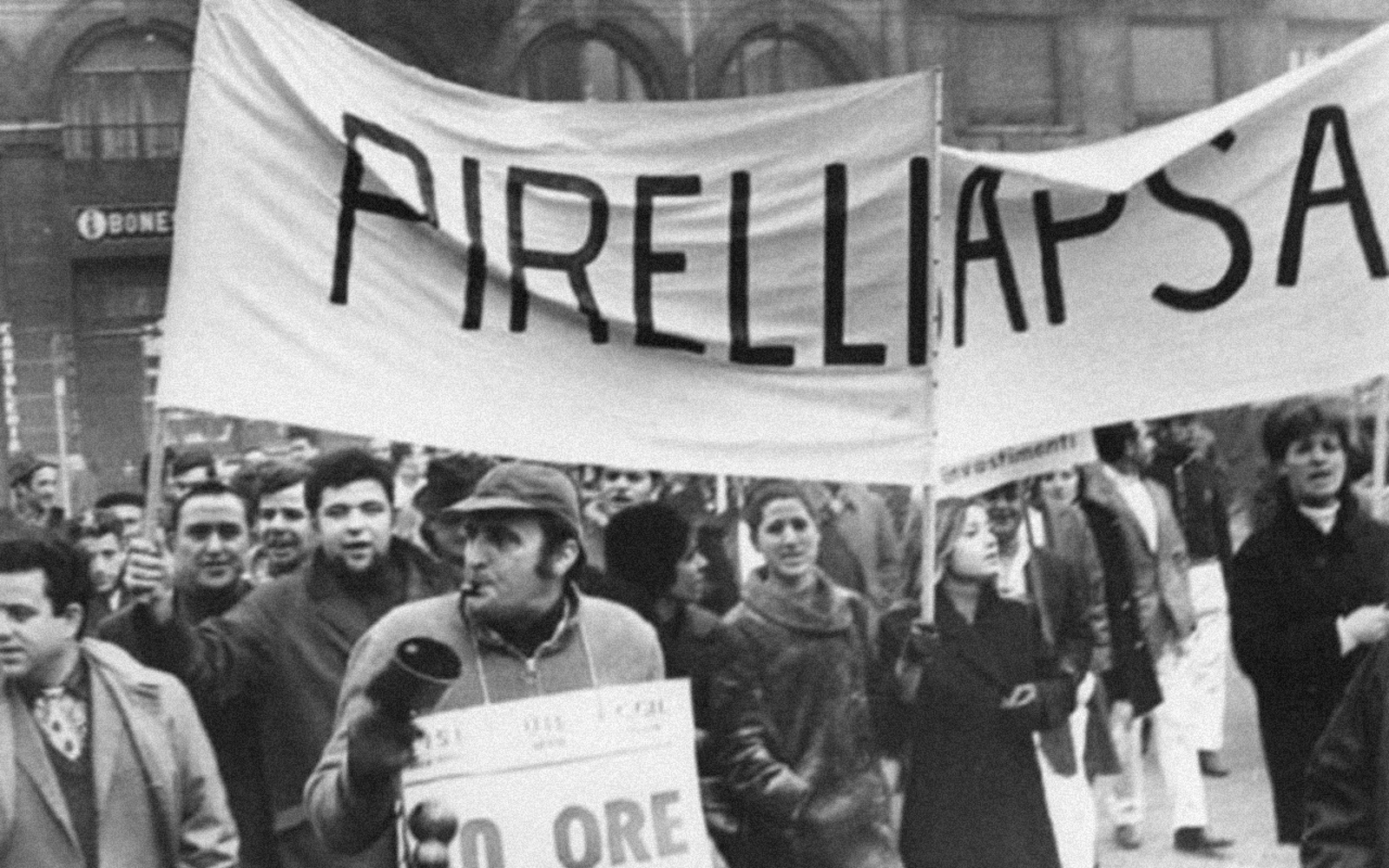
The Pirelli factory in Bicocca, Milan, was one of the places where the Italian 1968 worker movement was born from a deep discontent over wage conditions, working hours, and the lack of union rights.

Frustration culminated in a series of strikes known as Italy’s 1969 “autunno caldo” (hot autumn). The name “Pirelli” was traced countless ways during the protests, a meaningful contrast to the rules established shortly before.
At the start of the ’70s, Pirelli’s “institutional communication” became an ideal platform for typographic experimentation linked to the logo. The “long P” that once evoked the elastic properties of rubber now found new meaning in various graphics created by the Centro Agency.

For example, the logo was multiplied hypnotically as a metaphor for production and diversification…


…it was rotated around its axis by Bruno Monguzzi at Studio Boggeri to underline the internationality of a company present on a global scale…

…and it was flipped and connected by Ilio Negri, to be used as a decorative element on corporate gadgets and on the patterns of wrapping paper for over a decade.

In the late ’70s, as U.S. advertising continued to influence graphic design, typographic experimentation within Pirelli gave way to an emphasis on copywriting and photography.
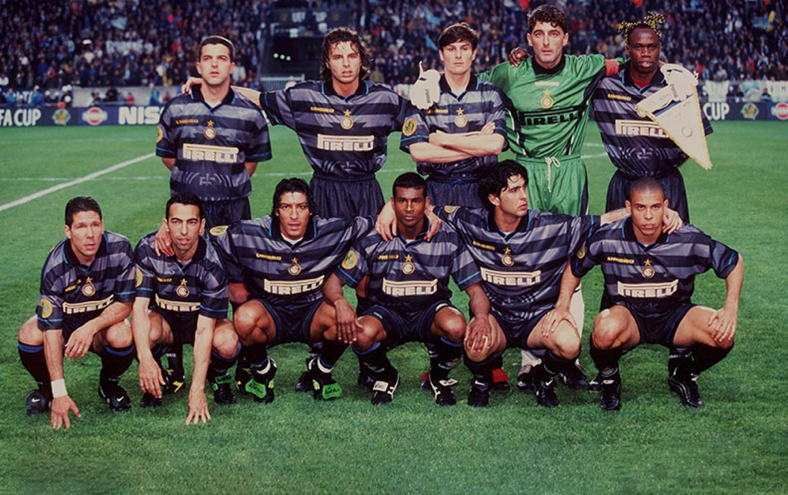
In the ’90s, the Pirelli logo started to appear on the shirts of football players for FC Inter Milan, beginning 25 years of sponsorship that would all but completely intertwine the P with the Milanese team’s identity.
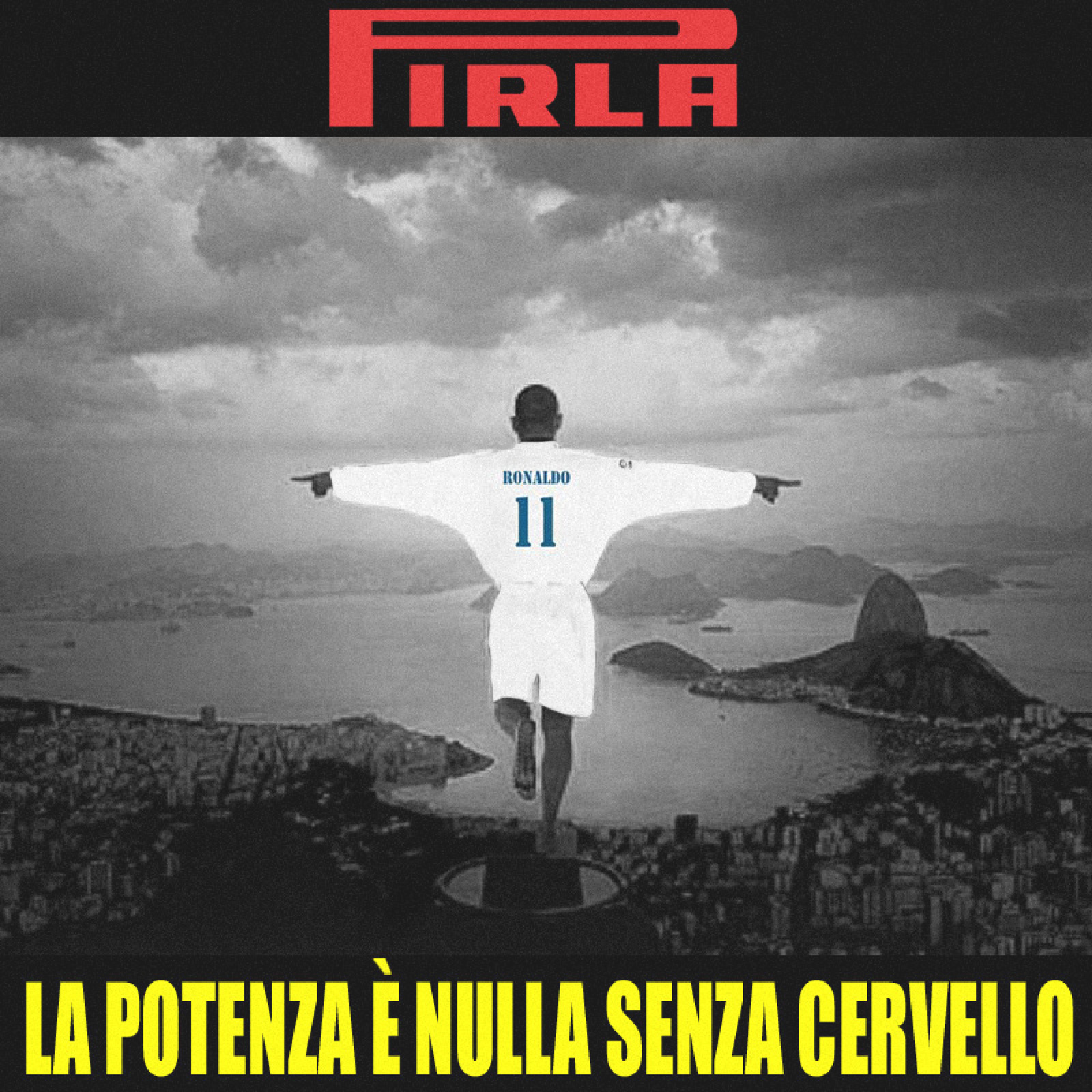
Along the way, the team’s supporters and its opponents have adapted the Pirelli logo in ways that are anything but official.
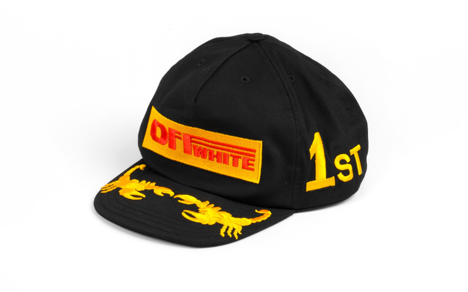
Recently, the link between the Pirelli logo and sports culture has also found confirmation in another “unofficial” trend, this one coming out of the fashion world as labels have taken to appropriating the logo to create branded bootlegs.


As the Pirelli P shows, a visual artifact can have a social history that’s both unexpected and uncontrollable. Looked at through this perspective, the “long P” offers an opportunity to reflect on what it means when a logo is no longer merely a corporate symbol, but part of a broader, collective image.
