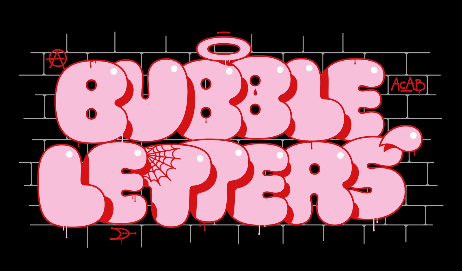
We’ll start with graffiti, because to understand bubble letters, it’s essential to look at graffiti. The first graffiti dates back to thousands of years ago…
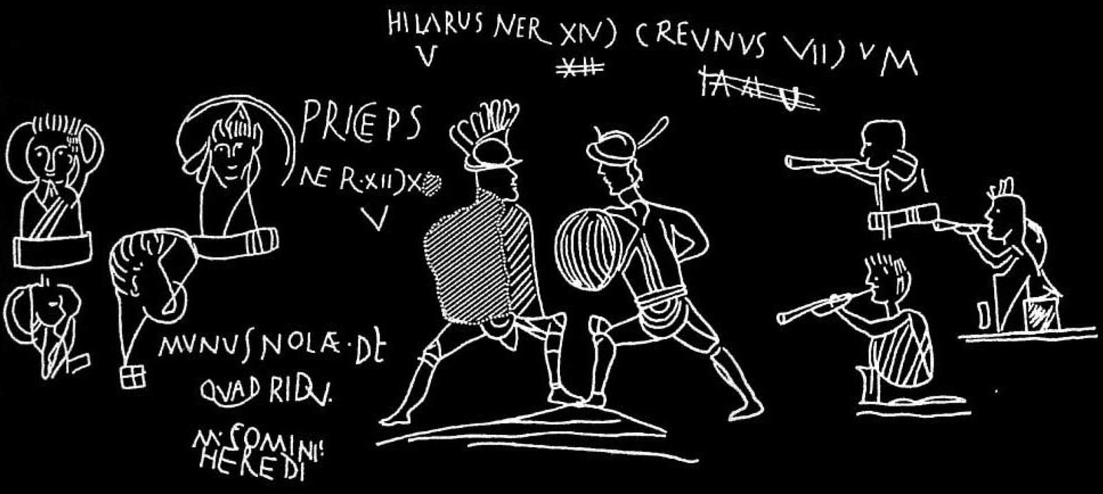
When archaeologists started excavating Pompeii in the 18th Century, they found inscriptions on houses communicating election appeals or announcements for gladiator fights. Some were simply a statement of existence: “I was here.”
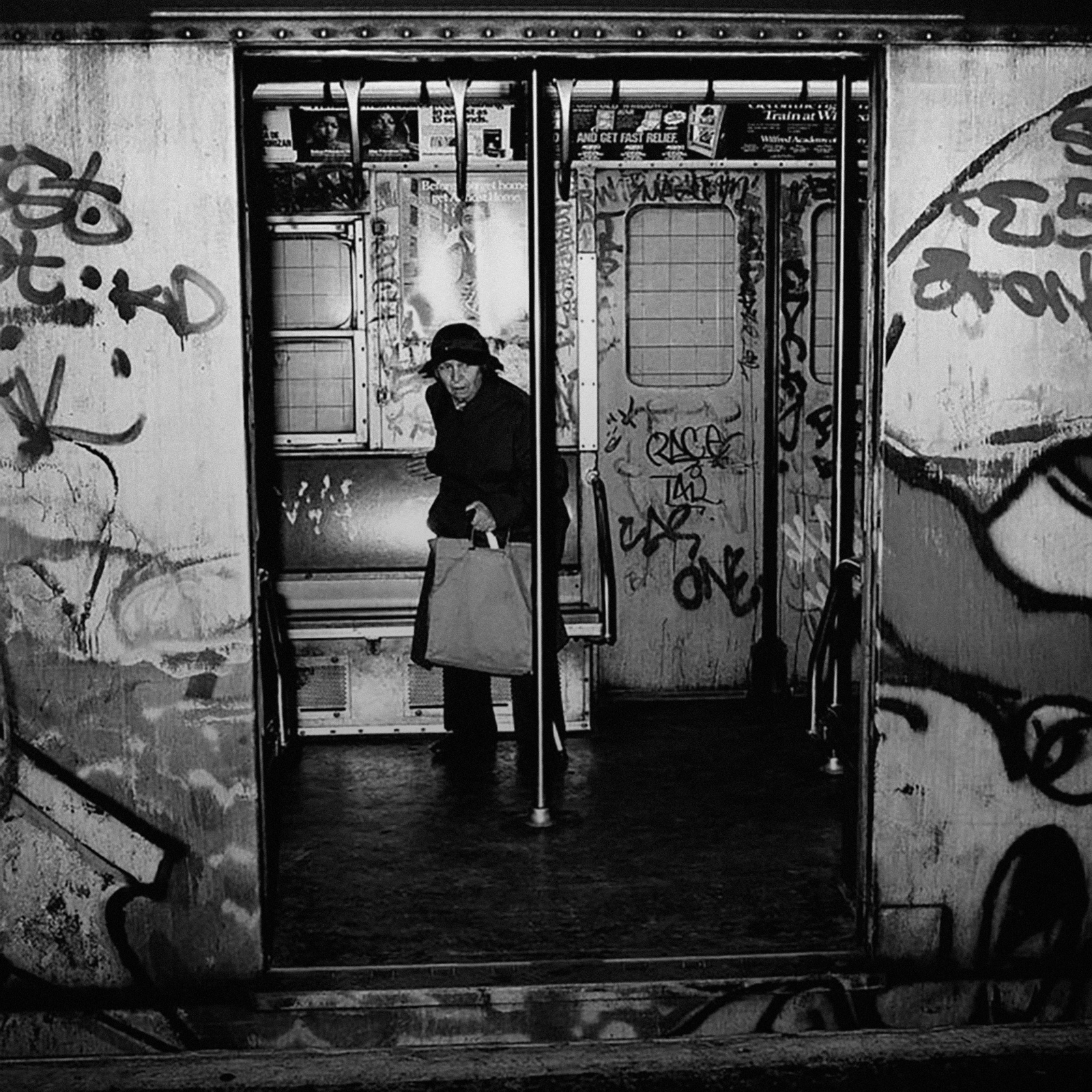
But the type of graffiti that comes to mind for most people first became widespread as a practice in the 1960s and ’70s. It was a period of social unrest. Spray paint had recently hit the shelves of hardware stores.
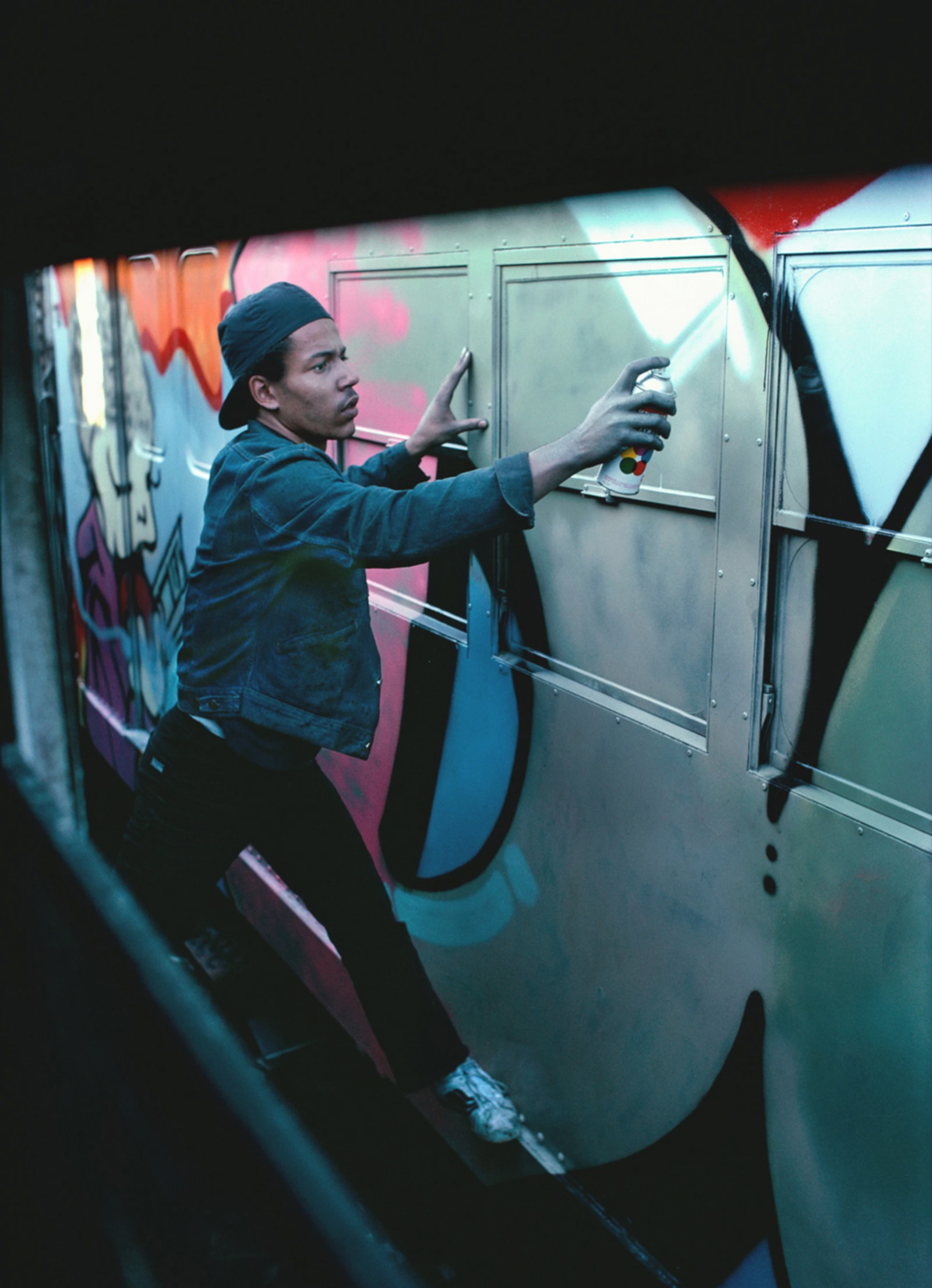
Graffiti writers — mostly young, mostly people in cities — started tagging trains, streets, and highways. Gang members used graffiti to mark their territory and writers used their tags to gain recognition.
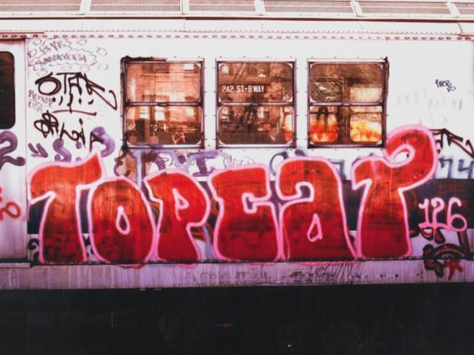
If you were in New York in the ’70s, you would have seen the tags of the first generation of writers like Julio 204, Taki 183, and Topcat 126, who brought the Broadway Elegant style – long letters with bold serifs — from Philadelphia.
Amidst the flood of new tags on the city, a new style emerged that would cause the streets to soften up…

In 1972 in New York, the artist Phase 2 premiered a lettering style known as “bubble letters,” also called “softies,” writing his name in enormous, puffy, but well-formed colorful letters.
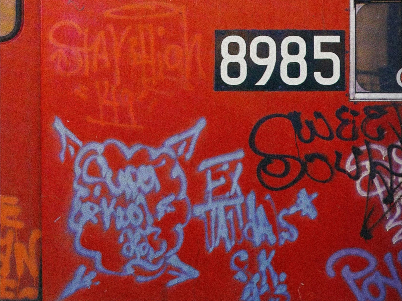
Phase 2 built this style partially off of the work of Super Kool 223, who drew clouds around his tag, copying the ones he found in comic books.
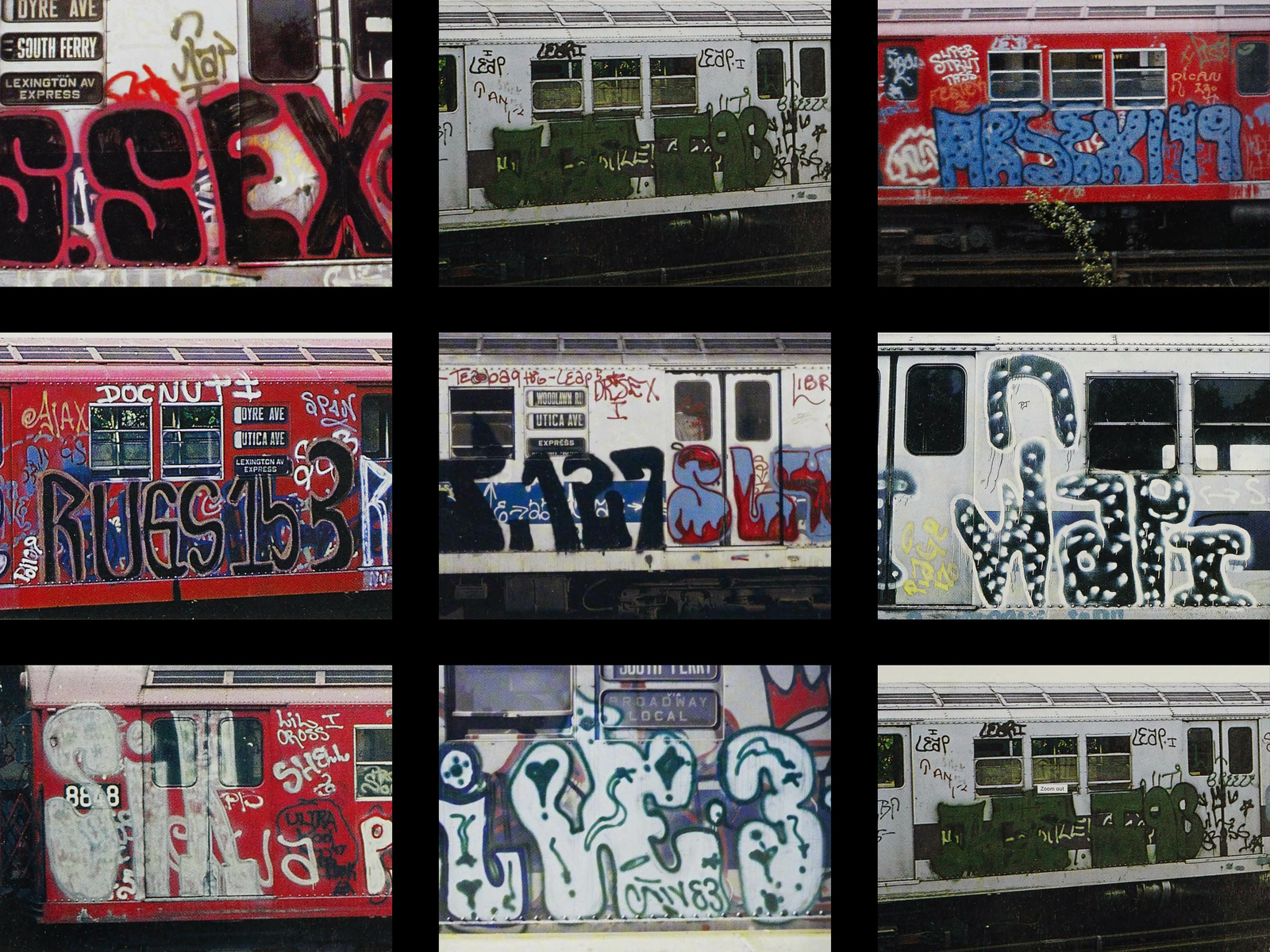
Copy cats of Phase 2’s style soon followed, and bubble letters could be seen all across town. A soft explosion.
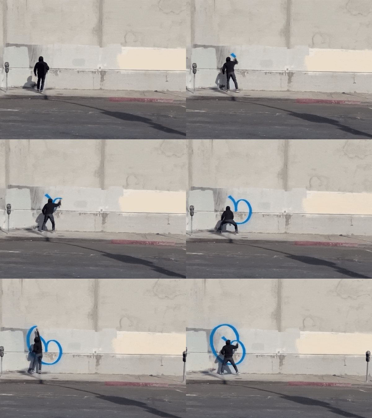
Bubble style caught on, in part, because of speed, which comes in handy when what you’re doing is illegal. The large, enclosed letters fill space quickly and are formed by a few confident curves that follow natural arm movement.
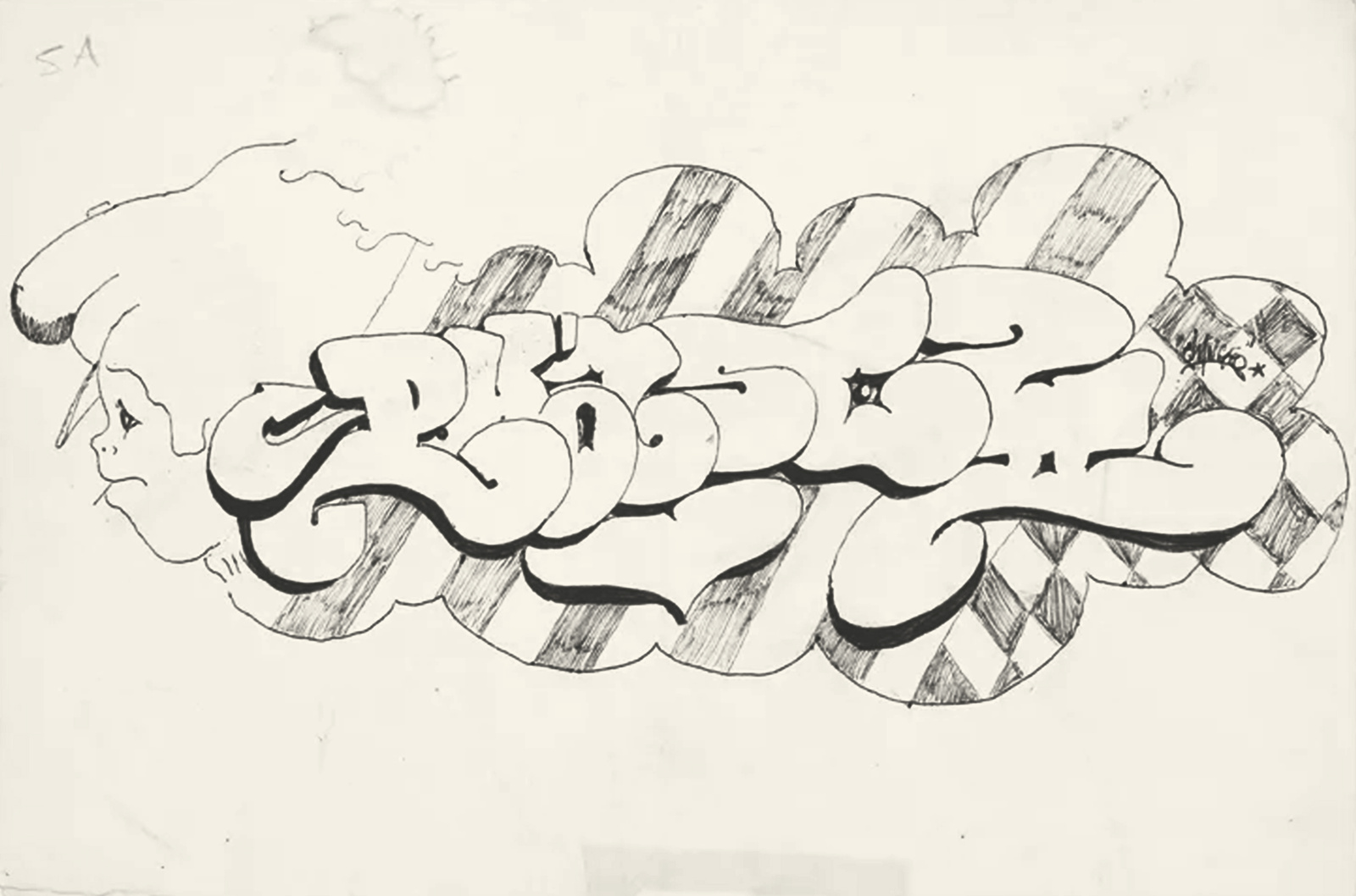
Phase 2 developed bubble micro-styles with names as brilliant as the designs: Phasemagorical Phantastic (with stars), Bubble Cloud (with clouds), Bubble Big Top (with outsized tops), and Checkerboard Phase Phantastic (pictured) to name a few…
Bubble letters sit between a simple tag and a complex drawing. For the graffiti scene, bubble letters helped mark a transformational shift from tags towards “pieces” — more expressive, elaborate lettering that stood out from hundreds of other signatures and duplicates.
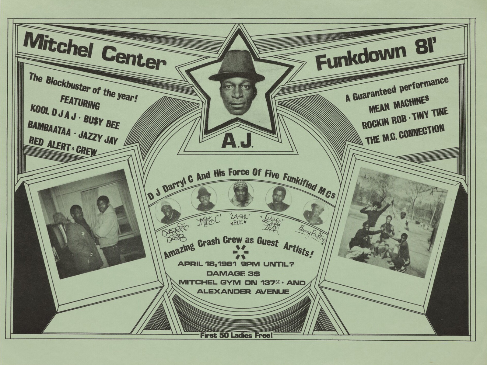
In the 80’s, Phase 2’s creative output extended beyond graffiti as he gained recognition in new fields such as graphic design, break-dancing, hip-hop.
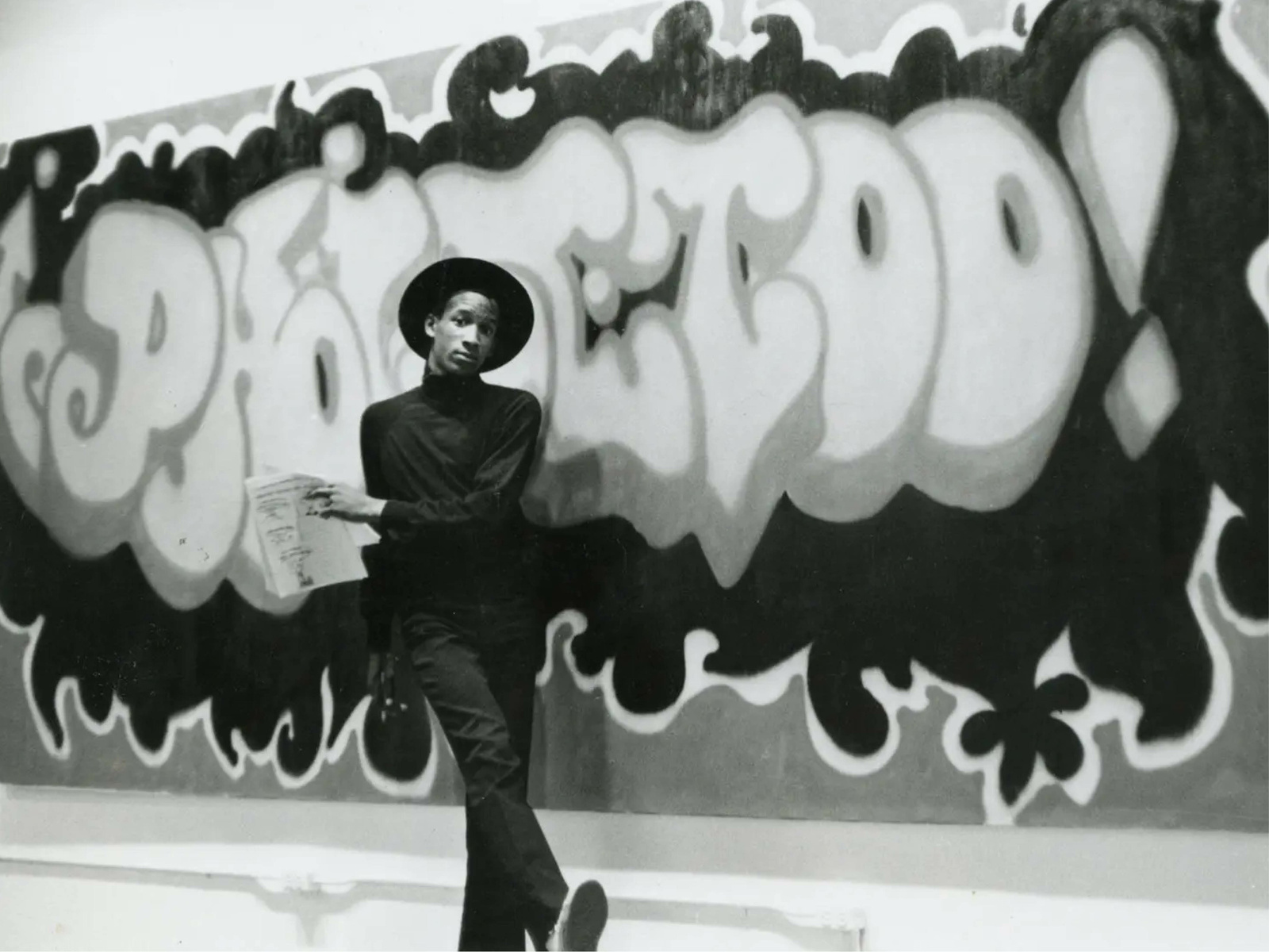
Despite his significant impact on the world of graffiti and hip-hop culture, Phase 2 remained a relatively enigmatic figure, always hard to get a grip on.
But let’s take a different angle on bubble letters. What was happening shortly before Phase 2 emerged in the graffiti scene? The exact origin of bubble letters is unclear, but there are a few places we could turn to…
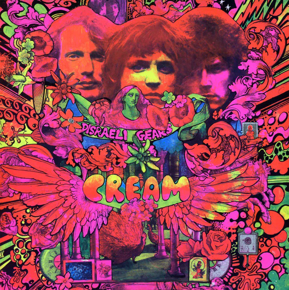
Like the hippies movement in the 1960s, for example, when everything was easy, soft, rounded: flowers, music, dreaming.
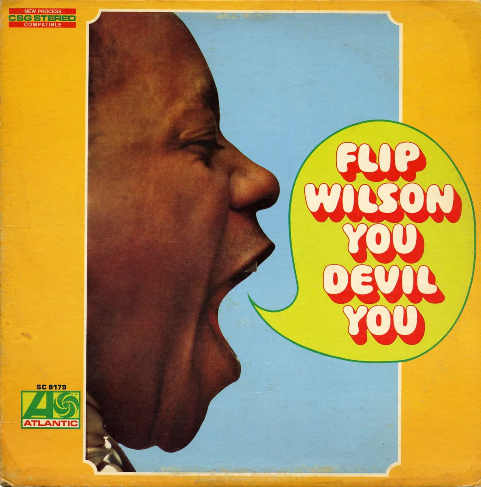
Or type design, at a time when West Bubble Gum by Dave West (c.1966, pictured), Frankfurter by Bob Newman (1970), Bronstein Bold by Robert Trogman (1971), and Lazybones by an unknown designer at the Letraset Studio (1972) all appeared on the market.
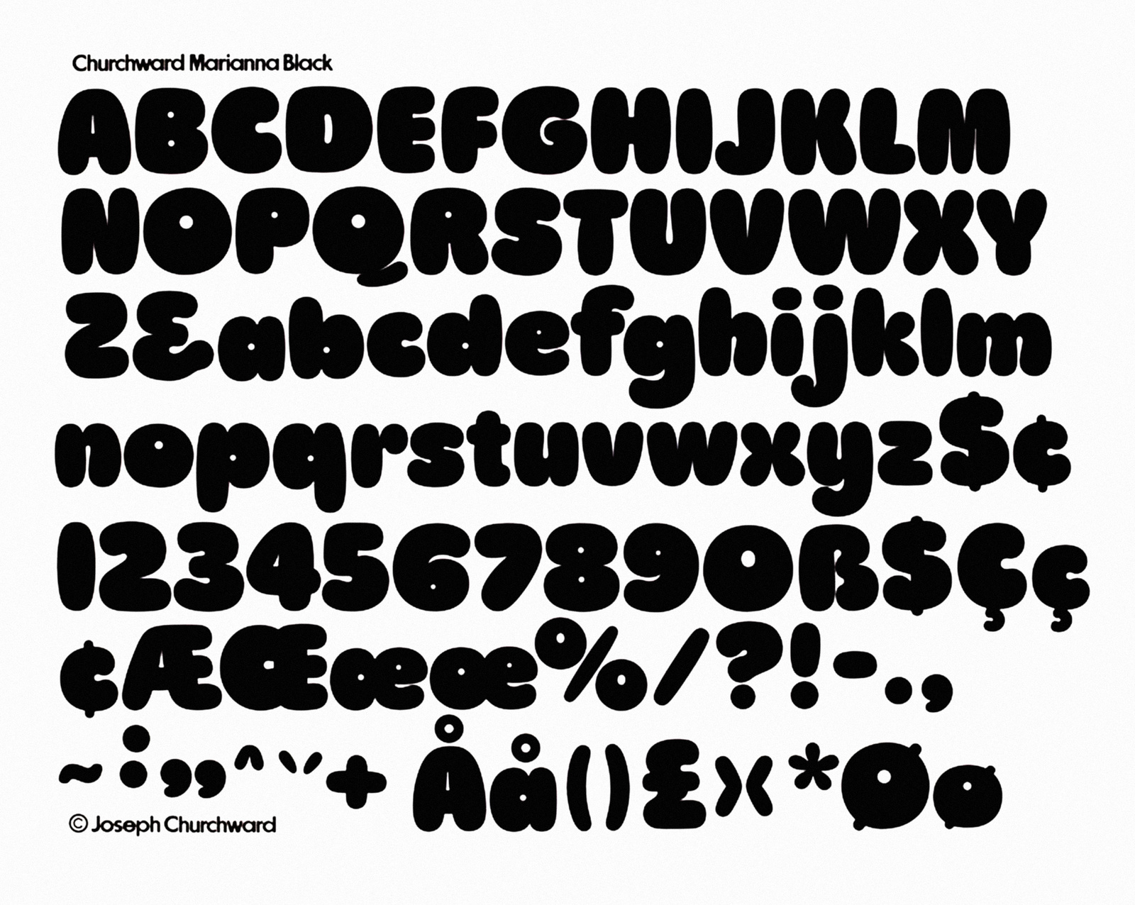
There’s also Marianna (1969), designed by Joseph Churchward and named after his six-year-old daughter. “I called it Marianna because Marianna was fat in those days and it was a fat design… you were plumpy… that’s why I called it Marianna…”.
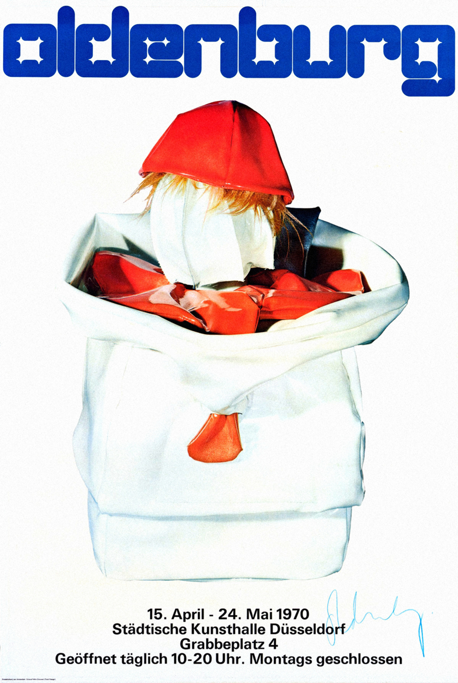
In 1970, Wim Crouwel drew rigid round letters for Claes Oldenburg’s exhibition at the Stedelijk Museum in Amsterdam.
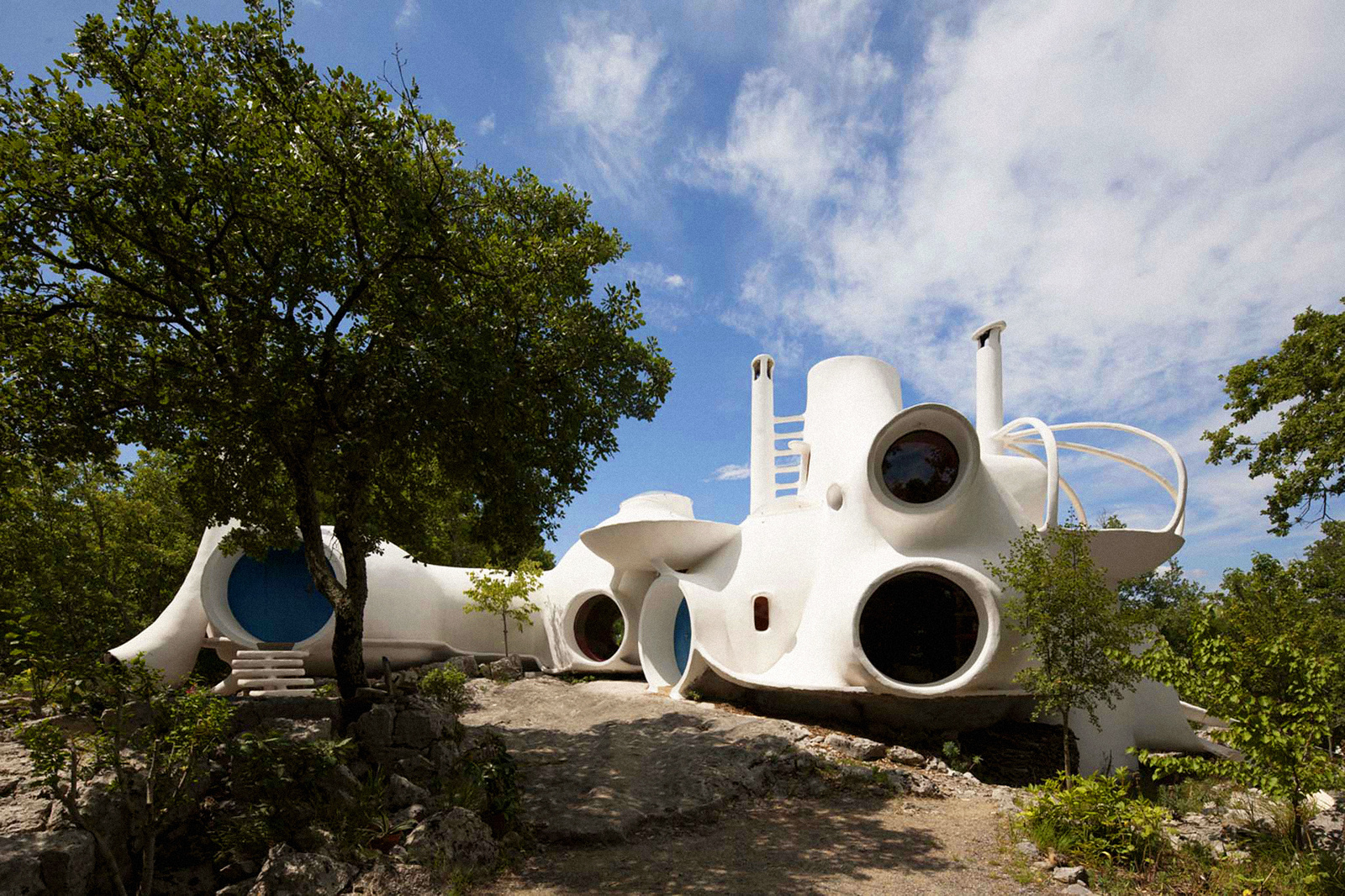
At the same time as bubble letters were being thrown up on the walls and trains of New York, architects like Claude Häusermann-Costy and Antti Lovag were designing bubble houses and buildings with a sci-fi feel.
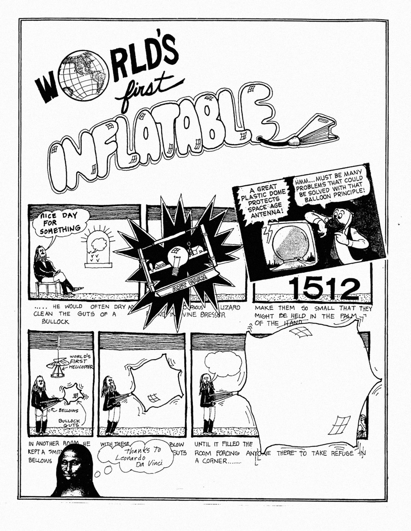
In 1968, the design practice Ant Farm was founded, proposing an inflatable architecture that’s cheap, easy to transport, and quick to assemble. Just like their architecture, the titles in their Inflatocookbook (1971) were also inflated.
Back to today: graffiti writers still draw their names in bubble letters, often referred to as a throw-up or “throwie.” And like any popular visual style, bubble letters have seeped their way into corporate branding.
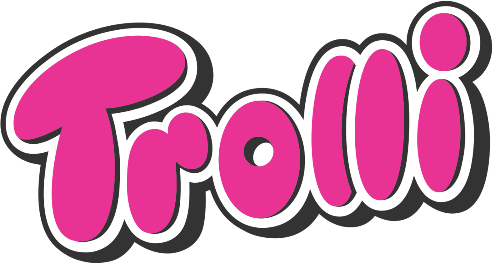
Because of their playfulness, and perhaps their association with teenage notebooks and notes passed in class, bubble letters are popular for kids’ products and candy, like the blob-like gummies made by the brand Trolli.
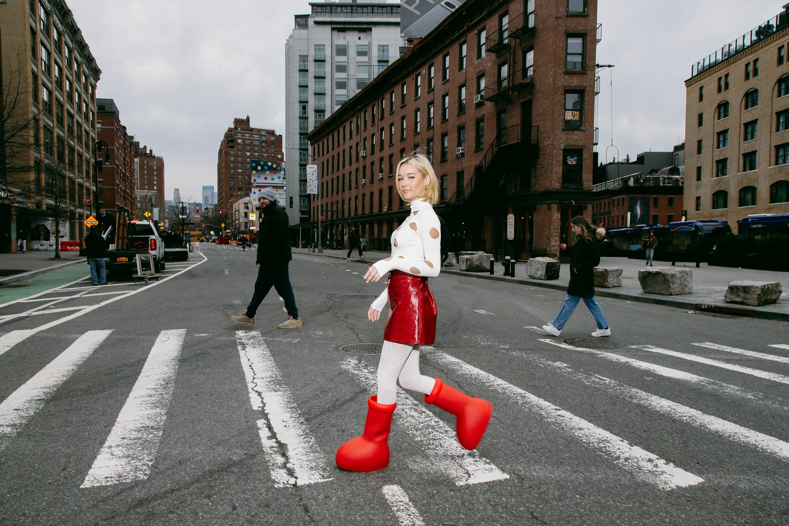
There’s also the physical manifestation of bubble letters such as the VW Beetle or the MSCHF Big Red Boots — examples of “blobjects,” a design approach that emphasizes the use of smooth and curvy forms with biomorphic shapes.
As dispersed as their origin story, bubble letters can be found in many different places and disciplines, their convenient form and their infectious playfulness evading easy classification. Probably for the better: pin them down and they pop.
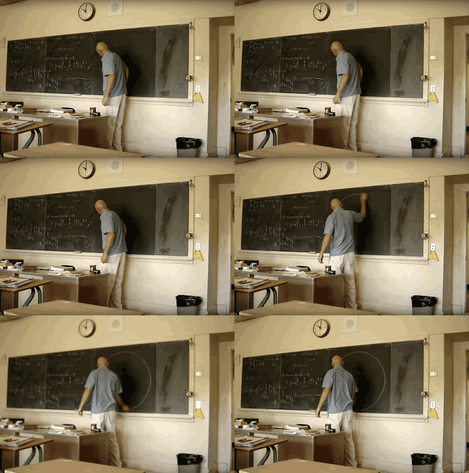
This is a throw-up too, right?
